
The Biotech Compass: A Practical Tool for Biotech Investors
Have you ever felt overwhelmed trying to keep up with biotech? The Biotech Compass is designed to help you find your bearings and navigate it.

Navigating drug discovery is hard for new investors. Between drug mechanisms, disease targets and the underlying science, it can be intimidating to work out which companies you want to invest in. And that’s before considering the company finances, regulatory hurdles and clinical trial design.
So where does a new investor start?
I have developed the Biotech Compass to answer this question. Born from my own frustration keeping up with the field, this tool provides a visual overview of any biotech company.
In just 15-20 minutes, the Biotech Compass will take you from ticker to tuned-in on any company through a visually intuitive and simple-to-produce chart.
See my article The Biotech Compass: Practical Run Guide for full details on how to use these prompts to generate your own chart.
For more details on The Biotech Compass, see the Biotech Compass Hub - all Biotech Compass Resources can be found here:
How the Biotech Compass Works
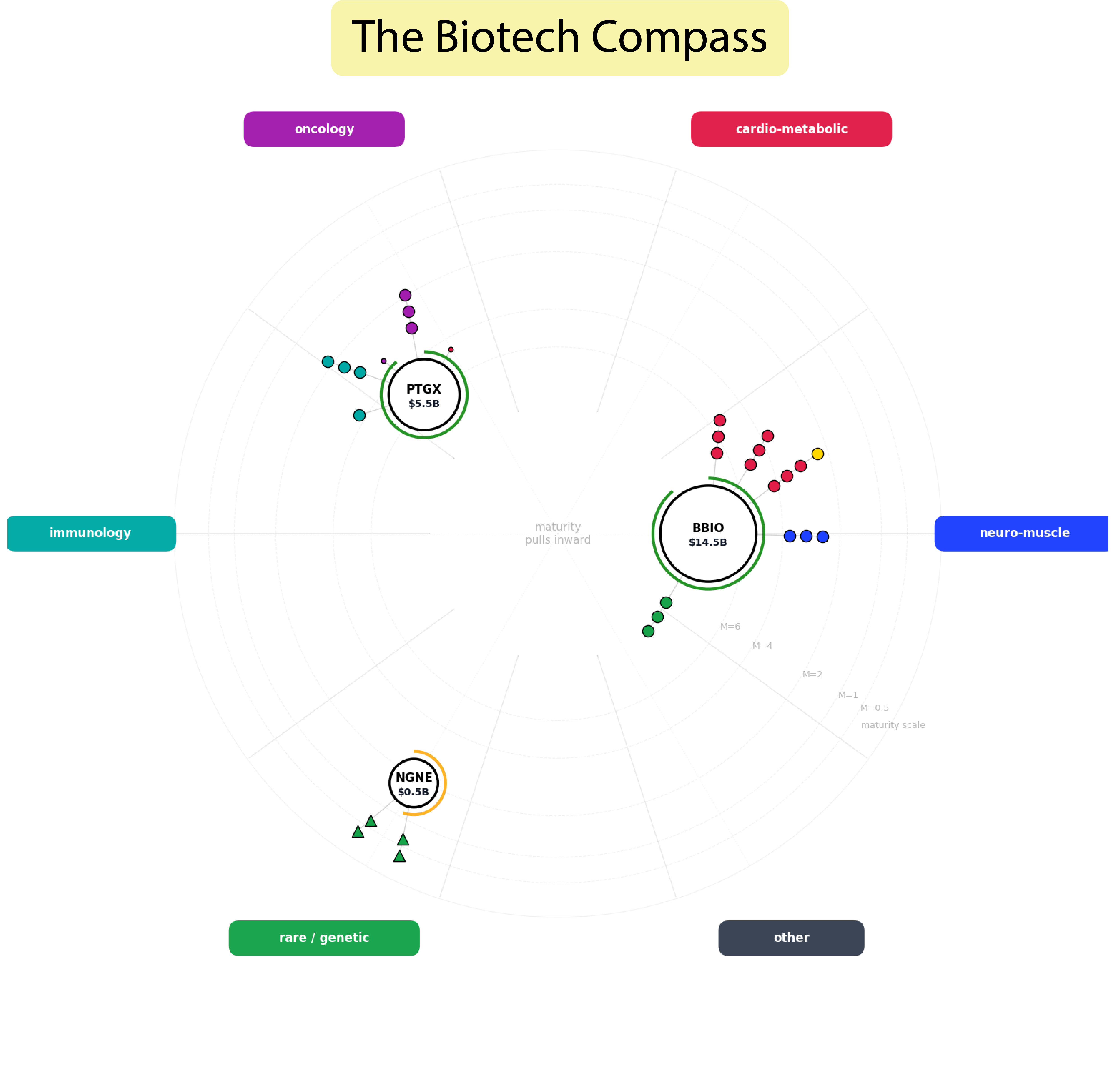
The Biotech Compass displays companies as nodes on a circular chart – like a constellation map.
Overview
How companies are positioned on the chart, and how each company node is ‘decorated’, tells you seven key details about the company at a glance. These are:
1. Pipeline breadth – how many assets a company has
2. Pipeline maturity – what clinical phase are the drugs in?
3. Disease focus – what are they targeting?
4. Drug modality – small molecule? Biologic?
5. Commercial/revenue generating assets – do they already have an approved drug?
6. Market cap – current valuation
7. Cash runway – are they financially comfortable?
These are the 7 key details any investor needs to know about a biotech company to begin their research.
Using the Biotech Compass, you can learn what a company does, how it does it, and whether they have the cash to see the project through in minutes.
The goal of the Biotech Compass is not to replace deep research but to give users a platform to begin their own investigation.
Reading the Biotech Compass
There is a lot of information depicted in the compass, but with a short explanation and visual keys, it should become intuitive to use. I have also provided a walkthrough (linked) article which takes you step-by-step through the process.
Node Decoration - What it tells you
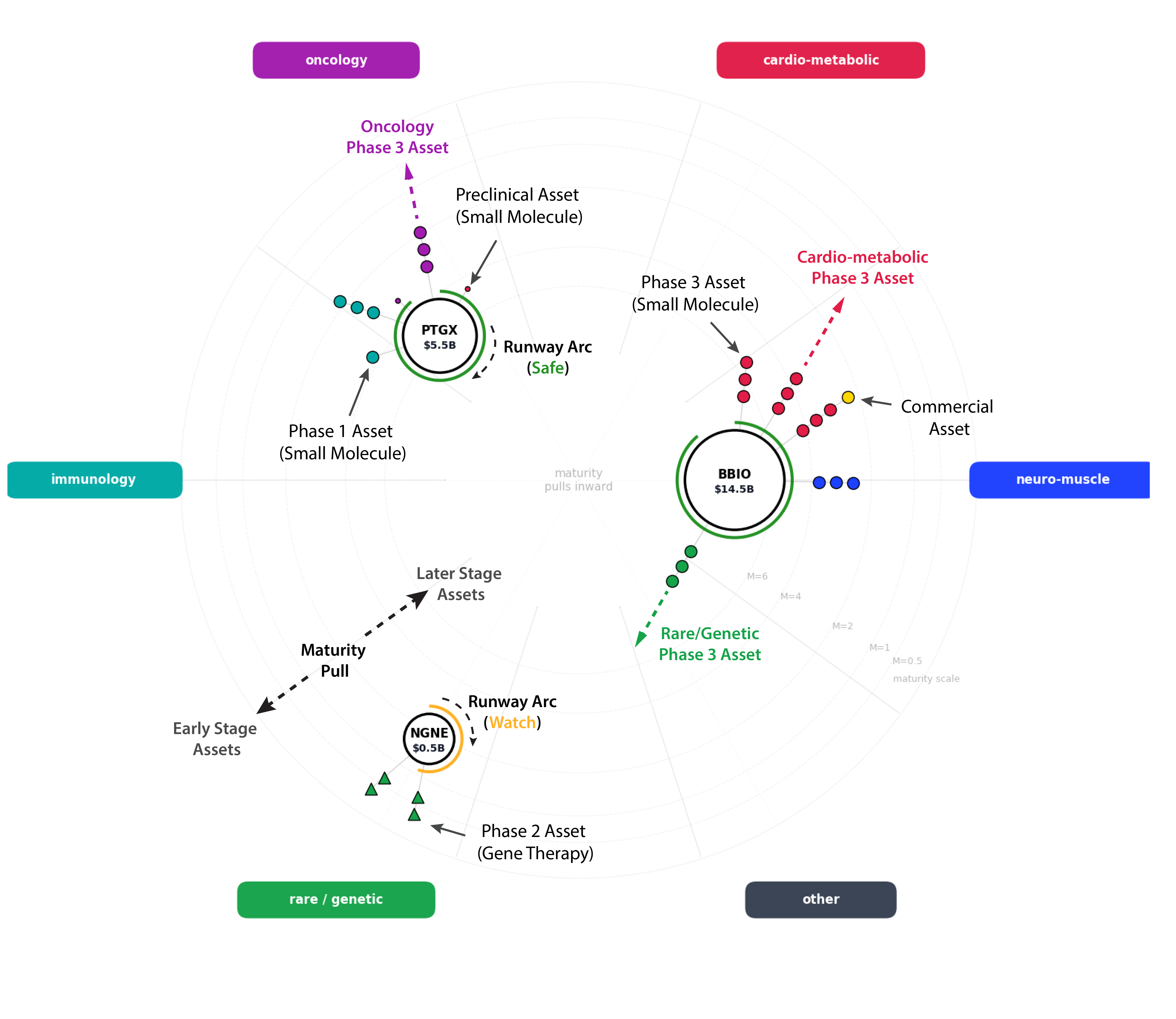
Each company is depicted as a circular node labelled with the company ticker and current market cap. The figure below provides a key for analysing the chart.
Each drug the company develops grows from this central node as a beaded-chain, with the number of beads equalling the clinical stage of the drug. For example, a drug in Phase 2 clinical trials will have two beads on that chain.
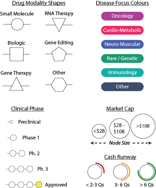
The drug modality determines the shape of the bead. For example, a small molecule drug would have circular beads, whilst a gene therapy would have triangular beads.
Beads are coloured by the disease area – a chain composed of red beads indicates a cardio-metabolic drug, whereas purple beads indicates an oncological drug.
Commercially available drugs get an additional gold bead to indicate revenue generation.
Two other financial metrics are also displayed: market capitalisation is represented by the size of the node, while cash runway is displayed as a warning arc around the company. A full green arc indicates a company with > 6 quarters of runway (safe), whereas a short red arc indicates < 3 quarters (risk).
N.B. Bucketing drugs by disease and modality is naturally crude. To compensate, a more detailed table accompanies each chart with specific disease target and modality details.
Company Position - What it tells you
How companies are positioned on the chart is determined by two weighted values: overall disease focus and overall pipeline maturity.
Overall Disease Focus. Companies may have several assets targeting several disease areas. Disease categories are placed around the compass as bearings, and the aggregated weight of all the disease areas a company works on will produce an angular position on the chart. This weighting takes into account the clinical phase of these assets too – for more details see my ‘Under the Hood’ article.
A single asset company will align with a single disease category, whereas a diversified company will drift. Each drug chain (described above) pulls in the direction of its disease category, so you can see what forces are acting on the company
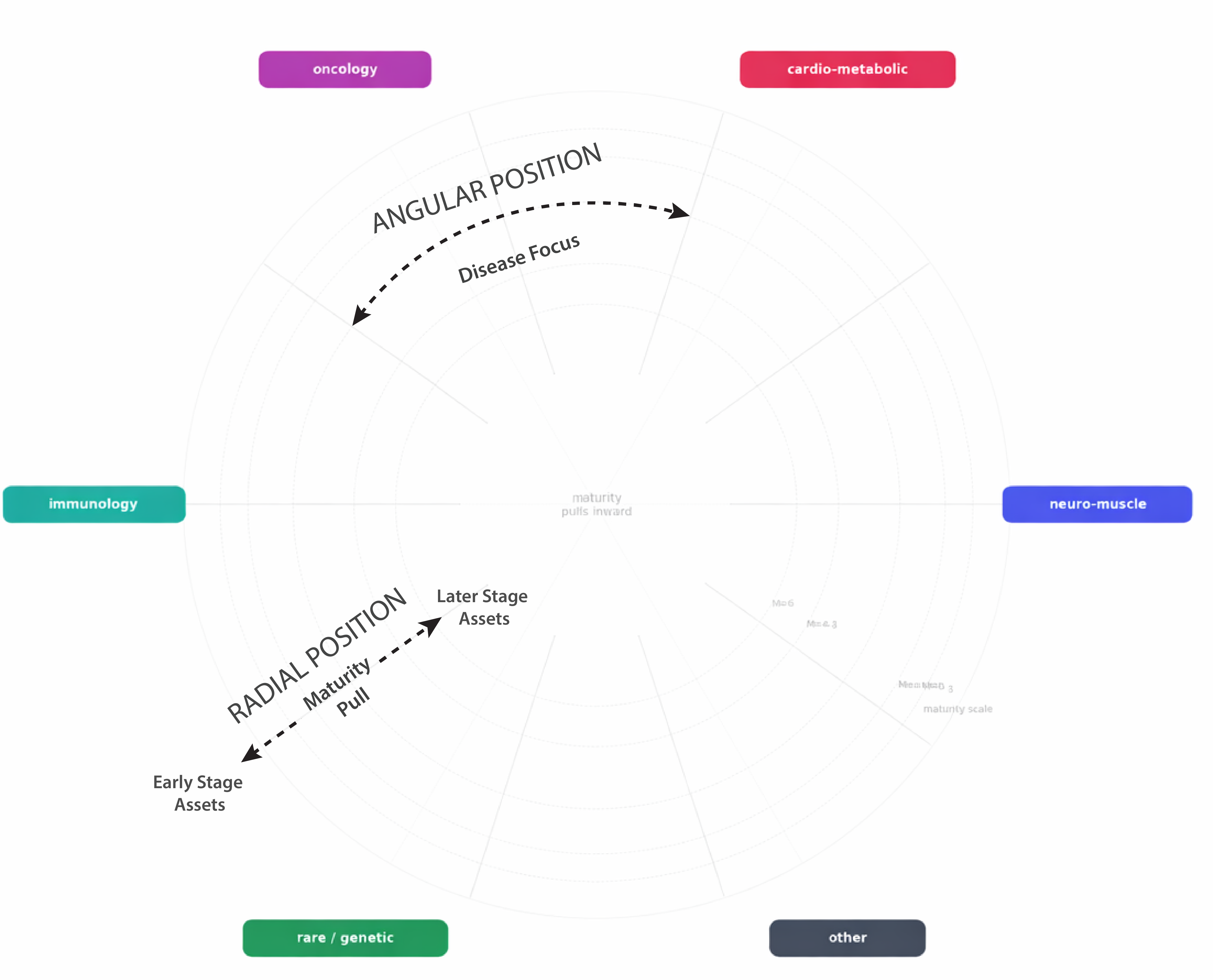
Overall Pipeline Maturity. The aggregated weight of all assets in a company’s pipeline, and their clinical stage, produces a maturity score. This dictates the radial position of the company – how close to the edge or centre of the chart it is placed. Early-stage companies remain at the edge of the chart, whilst larger companies with a more developed pipeline are pulled into the centre.
With both forces acting on company position, large, diversified companies will be drawn away from a single disease focus and into the centre, while single asset companies stay glued to a disease category at the edge of the chart.
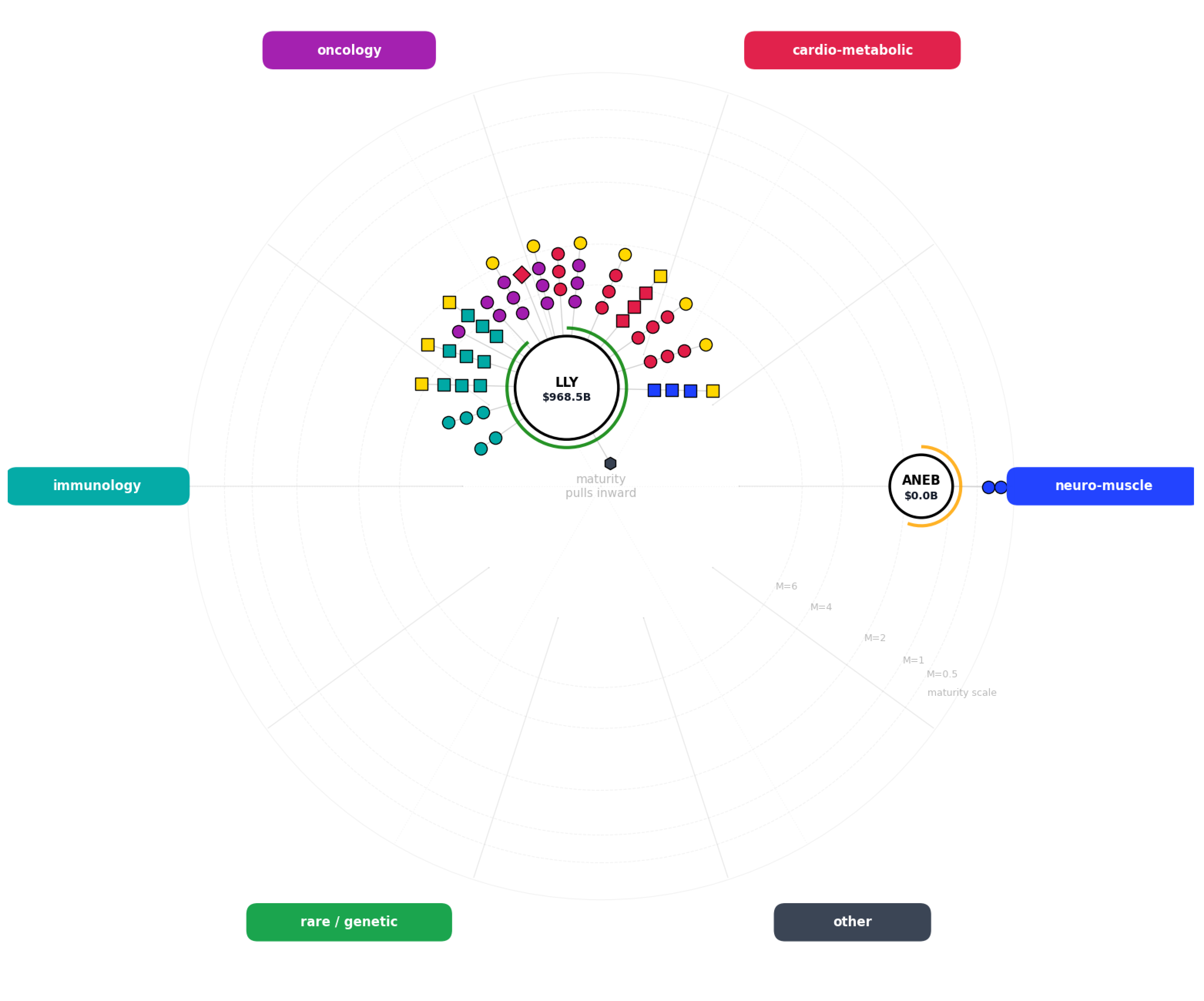
I have used an extreme example here, showing how the pharmaceutical giant Eli Lilly ($LLY) is positioned relative to the early stage Anebulo Pharmaceuticals ($ANEB). Eli Lilly dominates near the centre of the chart, with a highly decorated node and (unsurprisingly!) safe cash runway.
Anebulo Pharmaceuticals sits at the edge of the chart, with a single neuromuscular asset gluing it to that disease category. In practical use, the chart is best suited to companies in the $1B - $20B market cap range.
This gives the chart a temporal dimension too. Plotted over time, companies should naturally drift from the edge to the centre of the chart. This allows a company to be re-analysed on the chart frequently as it develops.
What can you do with the Biotech Compass?
Here is a chart showing five companies I was recently interested in:
BridgeBio ($BBIO)
Protagonist ($PTGX)
Abivax ($ABVX)
Lexeo ($LXEO)
Neurogene ($NGNE)
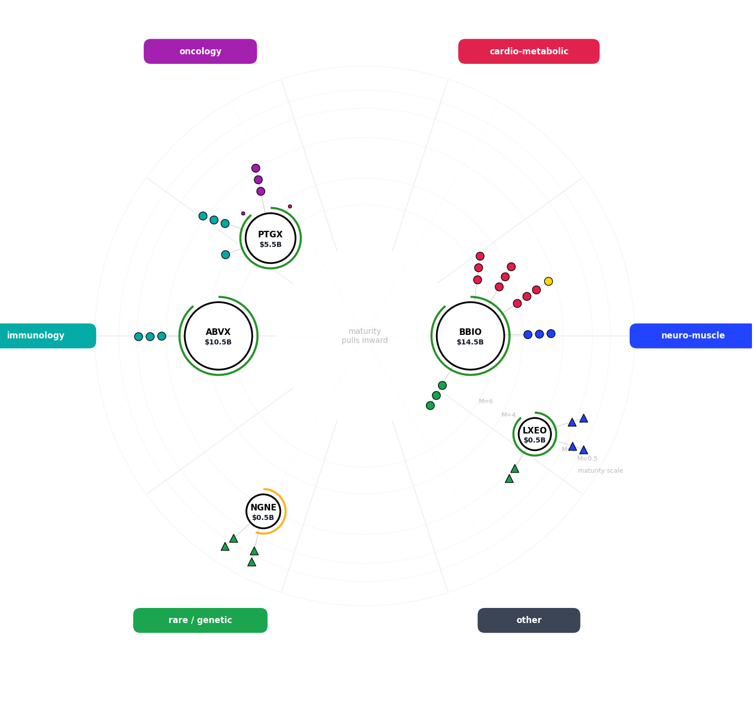
A single pass over the Compass told me a lot about each company. Here are a few things that stood out immediately:
· BridgeBio and Abivax have the largest market capitalisation
· BridgeBio, Abivax and Protagonist all focus on small molecule development
· Abivax is dependent on a single asset, while Protagonist and BridgeBio have broader and more diverse pipelines
· Protagonist has assets ranging from preclinical to Phase 3, while BridgeBio actually has a commercially available drug
· Neurogene and Lexeo specialise in gene therapy, spanning rare/genetic disease and neuro-muscular disorders
· BridgeBio is the most diversified company with drugs in the cardio-metabolic, neuro-muscular and rare/genetic categories
· Abivax’s asset targets an immune-related disorder
· Neurogene may be in a financially riskier position than Lexeo (runway arc)
The chart also prompted a set of follow-up questions that I could investigate next. Here are a few examples of what it made me want to find out:
1. Which drug has BridgeBio commercially released?
2. Has there been any top-line data released for their other drugs in late development?
3. What method of gene therapy are Neurogene and Lexeo exploiting?
4. Which specific diseases are they targeting?
5. Why does Abivax have such a large market cap and yet only one asset still in clinical development?
6. Why is Neurogene potentially in a riskier financial position than Lexeo?
This is exactly what I wanted from this tool – something to quickly turn companies into visual representations, rather than gathering information piecemeal to gain a patchy overview. Taking tickers discussed on social media and quickly visualising them with the Biotech Compass will allow investors to quickly get familiar with popular companies and join in the discourse intelligently.
Limitations of the Biotech Compass
This is a work in progress that I am excited to share. It is far from perfect. There are some limitations which are left by design, some which I intend to fix in future iterations, and some which I have likely not spotted myself. Below, I detail 4 key limitations as I have found them.
1. Coarse disease and modality bucketing
The Compass forces drugs into six disease categories and six drug modalities. However, many therapies do not fit neatly into a single bucket.
Lexeo is a good example – its gene therapy LX2006 could easily be considered cardio-metabolic or rare/genetic. This does not mean that the bucketing on the chart is incorrect – but subjective opinion may differ.
This is a consequence of simplifying massively variable drug companies into a single chart. However, to compensate, the code also generates a data table giving the specific disease targeted by each individual asset
2. Each asset is shown as one chain - however a single asset can be in multiple trials for multiple diseases
·This disguises the flexibility of a single drug and the number of ongoing trials a company has
However, showing each application of an asset as a single chain disguises companies dependent on a single asset
As drugs in multiple trials are displayed in the output table, this design choice was made to aid legibility and highlight asset dependence
3. Platform Novelty
The chart doesn’t make clear companies with novel drug platforms which could be independently marketable
For example Urogen’s RTGel® Technology would be masked in this chart - future iterations of this tool will display platform novelty
4. Infectious Diseases
At present, the Biotech Compass does not capture infectious disease programmes particularly well (e.g. vaccines, antibodies, antivirals, or pathogen-specific targets). This is a known limitation of the current version and will be addressed in future iterations.
This is not an exhaustive list, and other limitations will likely become apparent as the use of the chart broadens. However, the chart is under continuous development. I’m looking forward to feedback which will help to update and improve this tool.
How to use the Biotech Compass Yourself
I have made the prompts and code I have developed available to all subscribers of my Substack, and I have also produced a Practical Run Guide for trialling the Biotech Compass. Moving forward, updated and patched editions of this tool will be exclusively for my paid subscribers, but v1.0 will always be free.
The Practical Run Guide also details the data extraction mechanism of the Biotech Compass, as well as how to turn the extracted data into Readable Briefings to accompany The Biotech Compass chart.
See below for links to the relevant articles.
Happy Researching!
The Pharma Fox
If you’d like to explore further, here are the key companion articles:
If you’re new to the Biotech Compass:
→ The Biotech Compass Hub: All the Biotech Compass Resources in One Place
If you want to run the tool yourself:
→ The Biotech Compass v1.0: Prompts and Code
If you want a step-by-step walkthrough:
→ The Biotech Compass: Practical Run Guide
If you want to see a full example output:
→ The Biotech Compass: Readable Briefings
If you want to explore the raw output files:
→ The Biotech Compass: Raw Output
The Biotech Compass has been a two-month project aimed at overhauling how we research and analyse biotech companies. If you’ve found this tool useful or it has helped your own research, consider becoming a paid subscriber to my Substack.
I work on this independently and in my own time, so financial support helps me continue writing articles and developing tools like this. While Biotech Compass v1.0 will remain freely available to all subscribers, paid subscribers will receive access to future patches and upgrades, as well as additional tools and deeper-dive analyses as the project evolves.
Please feel free to get in touch with any questions or suggestions.
Contact
I look forward to feed back on the Biotech Compass. If you wish to get in touch, you can contact me via:
Substack: thepharmafox.substack.com
Email: contact@thepharmafox.com
© 2026 The Pharma Fox. All rights reserved.
The codes and accompanying prompts associated with the Biotech Compass are provided for personal use by individual subscribers only. Redistribution, sharing, publication, or commercial use - in full or in part - is not permitted without prior permission. No reposting or mirroring of the prompts/code (including in other newsletters, GitHub repos, or prompt libraries).
All prompts, code, and figures remain the intellectual property of The Pharma Fox.
For educational purposes only. Not investment advice. You are responsible for verifying outputs against primary sources.